Project type: Client project at RevUnit agency
Project length: 7 months
My role: Lead Product Designer (UI, UX, Research)
Collaborators: RevUnit product team (Product owner, tech manager, full-stack developers, design manager, UX researcher), key stakeholders
Project length: 7 months
My role: Lead Product Designer (UI, UX, Research)
Collaborators: RevUnit product team (Product owner, tech manager, full-stack developers, design manager, UX researcher), key stakeholders
Early engagement
In the summer of 2019, RevUnit partnered with a quick-service restaurant chain and embarked on an exciting mission to empower restaurants and accelerate training. We aimed to design a simple, elegant digital experience for store operators and training directors that will support the learning journey of their team members.
Our first engagement started with a workshop at the corporate headquarters. We spent a day with operators, training directors, and stakeholders to validate the problems and start ideating solutions. We did a series of exercises that allowed divergent and convergent design-thinking.
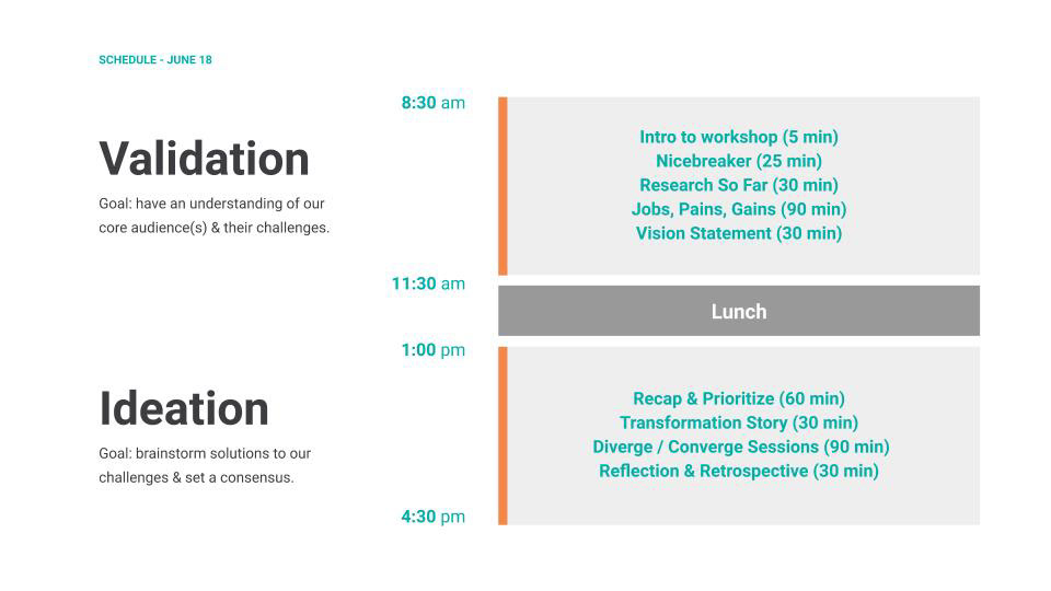

RevUnit's workshop session
We heard that prioritizing training was difficult. Many restaurants experienced high turnover with team members in high school. We sensed a desire to standardize training across all restaurants, yet many store owners also wanted the flexibility to operate with freedom and creativity.
The restaurant chain had an existing internal training application. While this application housed a lot of good content in the format of videos and interactive quizzes, the adoption among restaurants was low. Operators cited a few reasons for this:
1. Poor content structure and user experience
2. Delay of login access for new team members
3. Prioritized in-person training
2. Delay of login access for new team members
3. Prioritized in-person training
Following the workshop, RevUnit's product owner and I went to visit a restaurant in our local area to further learn about their operation and training. We asked questions about different roles in the restaurant, onboarding process of new team members, ongoing training, usage of the existing training application, and other software.
Vision Casting
After processing the learnings from our early engagement, the RevUnit team resolved to focus our efforts on the following four themes:
1. Streamlined sign up process (prototype only)
2. Customized checklists (MVP built and tested*)
3. Progress tracking (prototype only)
4. Quick search/browse (prototype only)
We set out to spend the next eight weeks rapid prototyping these themes to vision-cast our ideas.
My design process involved user interviews, stakeholder interviews, wireframing, stakeholder/product team feedback, prototyping, and usability testing.
I used Zoom for remote meetings and design critique sessions. Whimsical and Sketch were used for wireframing and prototyping. We gained the trust of our stakeholders by bringing them into our process, asking for feedback often, and occasionally running the usability tests with them.
Our stakeholders helped us put together the pilot group. The pilot group consisted of fifteen restaurants, and we kept open communication with the operators and the leadership teams of those restaurants. Their participation in interviews and usability testing played a massive role in the iterations of our app.
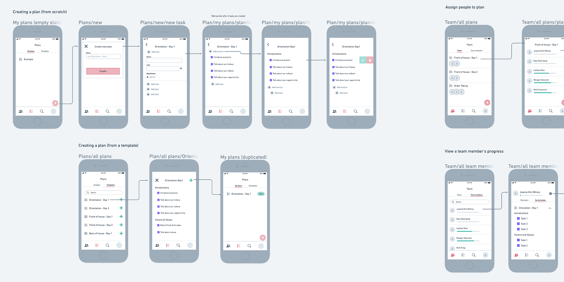
Early wireframes
Design Exploration
1. Streamlined sign up process
Key insights from user research
1. Earlier, we assumed that our training application would be accessible by a mobile device. However, we learned that many restaurant owners and managers did not allow their employees to look at their phones on the job because they appeared unprofessional even though the reason could be job-related. 2. Many training managers were sharing log-ins to their shared devices so that multiple employees could access the training and operational applications.
Solutions presented
What's better than a quick sign-up process? No sign-up process. We decided to address the need to access content quickly with a centralized "store mode" account. By removing the barrier of logging in, anyone with a shared device will be able to quickly search the information they need, increasing productivity in restaurants.
Feedback
Many restaurants loved this idea, but our stakeholders raised some security concerns. Easy access to the shared device could mean that it could be stolen and personal data compromised. To address these concerns, we discussed the possibility of using biometrics to unlock the shared device.
2. Customized checklists
Key insights from user research
1. Checklists are used regularly in operations. 100% of restaurants had at least one type of checklist in daily usage. For example, many restaurants will have a list for opening and closing a restaurant.
2. Some restaurants would have more resources and have specific roles, such as training managers. Other restaurants are smaller and leaner. A general manager could wear multiple hats and train employees on top of other duties.
3. Many restaurants used third-party applications such as Trello and Jolt (an operations checklist app) to train their team members and keep track of progress.
4. Training can happen in groups or individually. For example, onboarding was a regular group training for most restaurants.
Solutions presented
Our initial framework of a training plan was a simple checklist comprised of tasks and sections. Tasks can include detailed information and the attachment of photos and documents. Training directors can assign different training plans to their choice of team members. Since learning that the group training was a common occurrence, I made sure to allow the creation of groups to speed up the assignment of training plans.
The trainer is more likely to focus on each learning task in group training. However, there were also times when a trainer gave more attention to individual employees and provided feedback. These insights led us to explore two tabs, Task View and Member View. Task view would allow the trainer to look at a list of tasks and see the progress of assignees. Member view would display a list of employees and their progress.
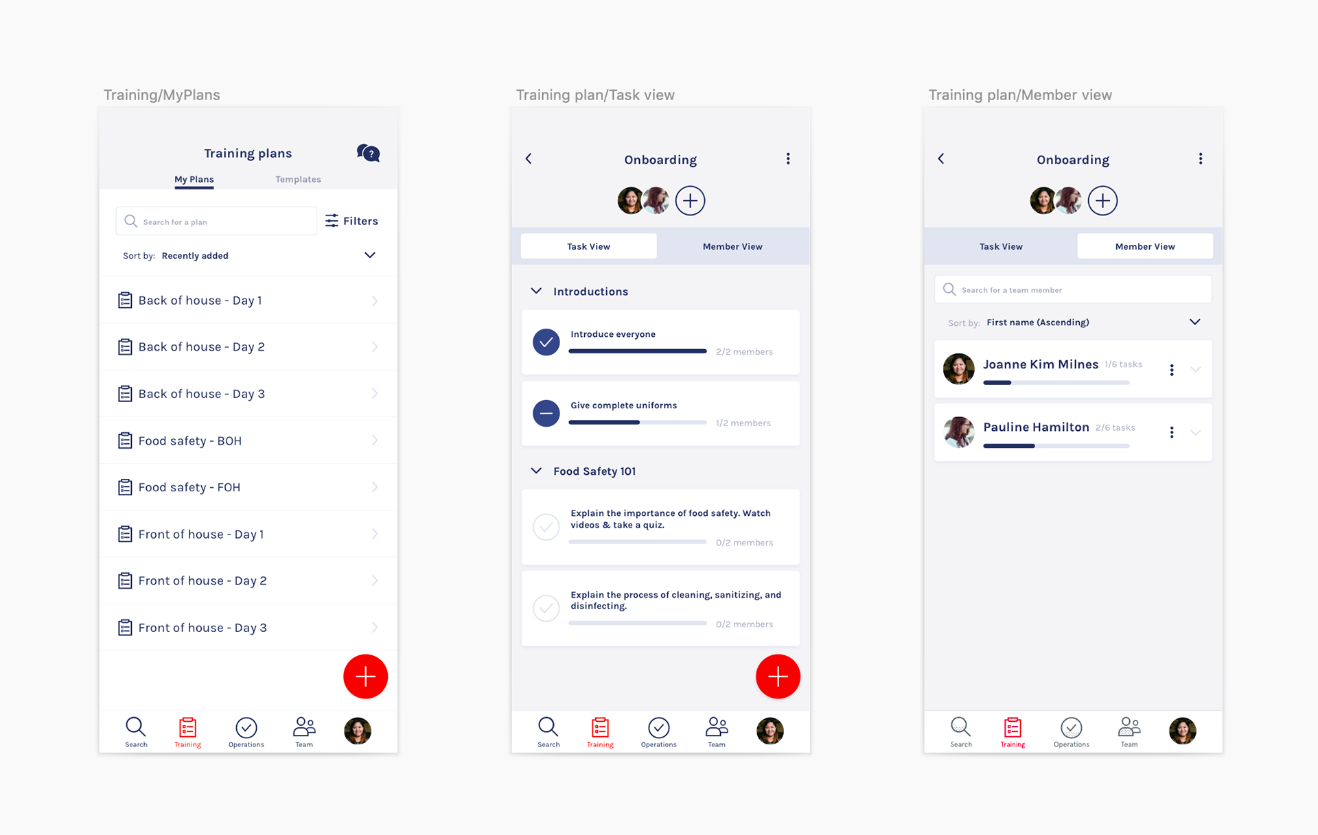
Final high-fidelity designs of Training Plans
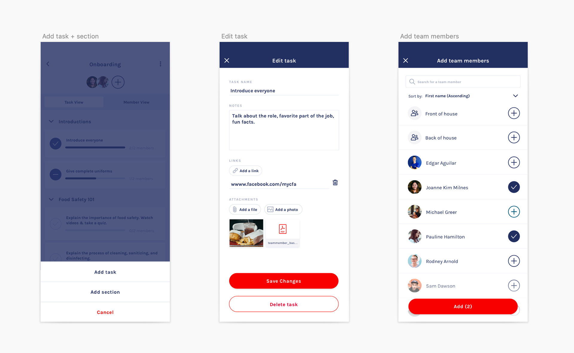
Add task, Edit task, Add team members
MVP Launch & Learn
This solution was a focus of our MVP, and we built a native iOS app with a checklist functionality that restaurants could use for onboarding new team members. We set one of our key results to be a reduction of dependency on third-party checklist apps by 80%.
We launched the MVP with our pilot group in October. The RevUnit team continued to gather user feedback and learned critical ways to improve the flows and add new features.
For example, we planned to allow the creation of different types of tasks - such as tasks you can complete by taking a photo or typing in a text box. We also saw an interest in training directors' ability to add notes after checking off a task.
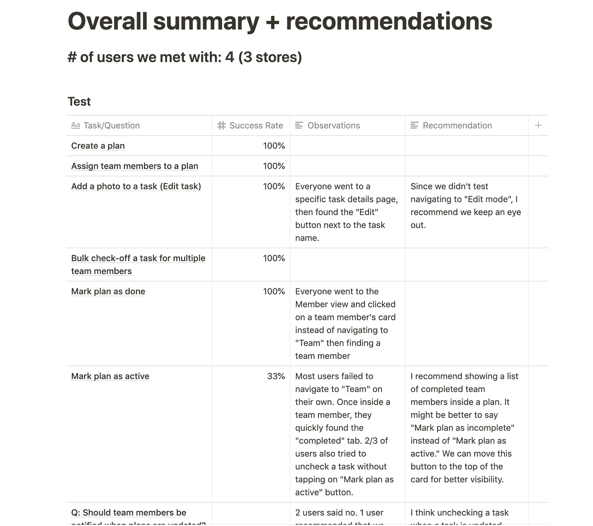
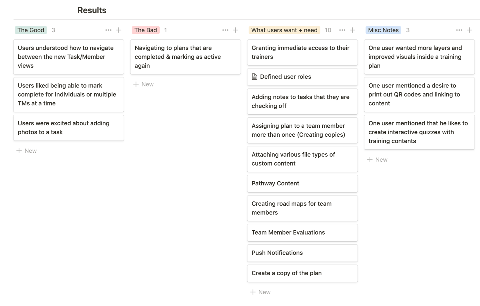
A screenshot of usability test results
3. Progress tracking
Key insights from user research
1. The restaurant chain is passionate about its team members' growth. The transparent level system that many restaurants embrace encourages team members to accelerate their learnings and grow into leadership roles.
2. Many restaurants had fun names for their levels such as Black belt, White belt, Ninja, etc.
3. Many restaurants admitted that training mostly happens in the first 30 days when an employee starts the job. Many will have check-in after 60 days, 90 days, and one year to ensure that the employee performed and met the expectations.
4. In some states, certain types of training were required by law. Those types of training needed to happen on schedule, so they had an additional need to track time and notify an employee when the training was due.
Solutions presented
We wanted our app to support the existing systems with levels. RevUnit team and participating restaurants brainstormed some ideas for badges to make it fun and rewarding to achieve all types of career goals.
Feedback
Our stakeholders and restaurants were very excited about our solutions. Many restaurants expressed the desire to create the names for the levels and badges. We discussed the possibility of providing badge and level packs in a marketplace to be more customizable by restaurants.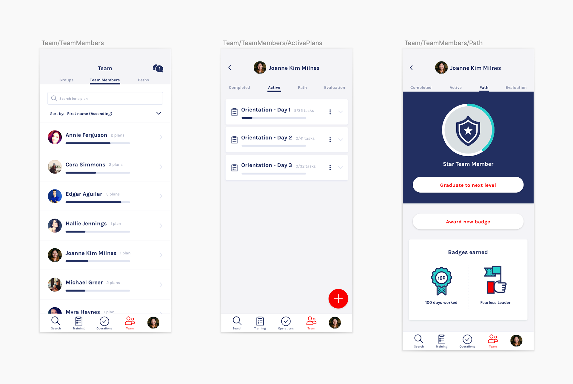
Team member's active plans (middle), level and badges earned (right)
4. Quick search/browse
Because searching content was one of the most significant pain points with their current application, we envisioned searching to be smarter. Searches should yield the most relevant content, be easy to filter and recommend personalized content for your role and restaurant.
While we didn't spend a ton of time on discovery and design in this area, we presented a few screens to tease out the search experience.
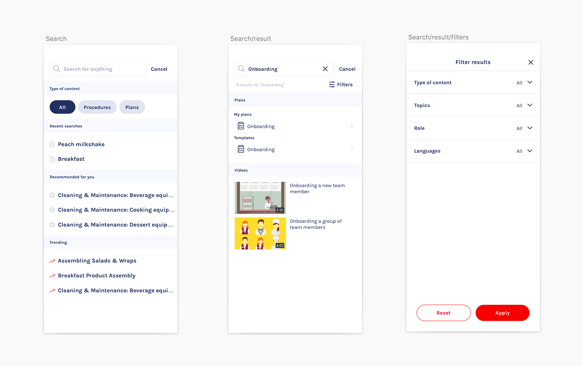
Search page, results, and filters
Final Outcome
By December, we iterated on a lot of new feature ideas. We also saw an opportunity to design and build checklist functionalities that benefit operations and not just training. This sudden pivot made some of our pilot group participants unhappy. Perhaps, we tried to accomplish too many things and lost sight of our initial objective.
In January, a new stakeholder stepped in and decided not to renew our contract. Concerns for the growth and maintenance of our application grew immensely, and the corporate headquarters wanted to try having a new set of eyes on the project.
I took away a memorable lesson to pay more attention to the business goals of our stakeholders. While I am disillusioned with the outcome, I am thankful for the opportunity I had to re-imagine the training experiences of this restaurant chain.