
In MineralSoft, we use the AG Grid framework to display financial statements, land objects (tracts, wells and units), and legal documents (leases, deeds and division orders). AG Grid has tremendous built-in functionalities, such as changing the ordering of columns, filtering, sorting, exporting to Excel, and more. But frameworks are only as good as the implementation.
Our implementation of AG Grid tables falls short in many areas. Above all, I find it frustrating that the users are not aware of many existing functionalities and that our tables do not serve the intended purposes as designed. To improve our tables' discoverability, I advised of three key areas to investigate, and I also presented some solutions to address the problems and improve user experience.

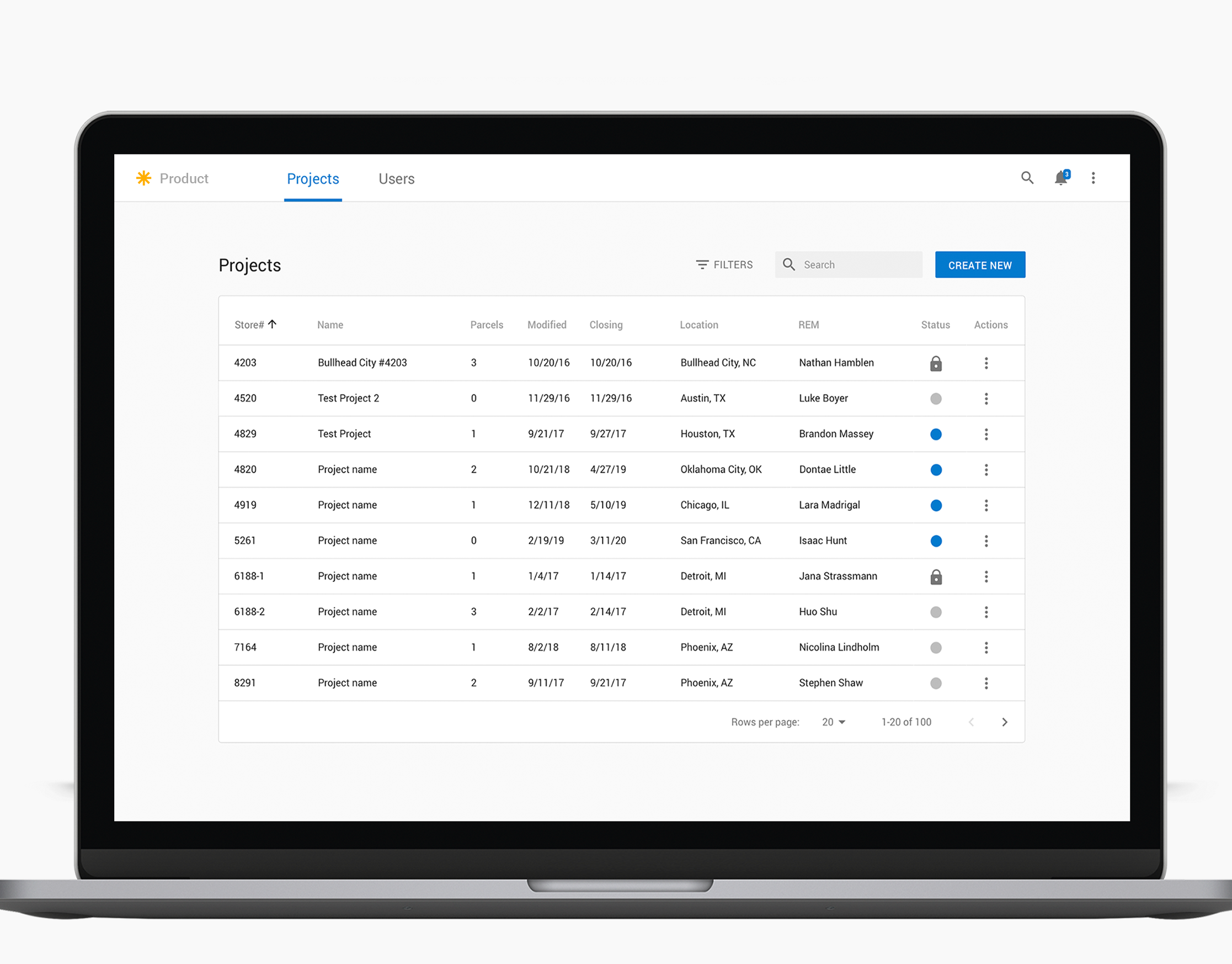
An example of a table in MineralSoft
1. Adjust Columns
Currently, we have two buttons in the search bar above the tables: "Adjust columns" and "Reset Table." Clicking on "Adjust Columns" opens up a side panel where the user can select or deselect which columns to display. The "Reset Table" button will reset the table to the default number of columns and original width settings.
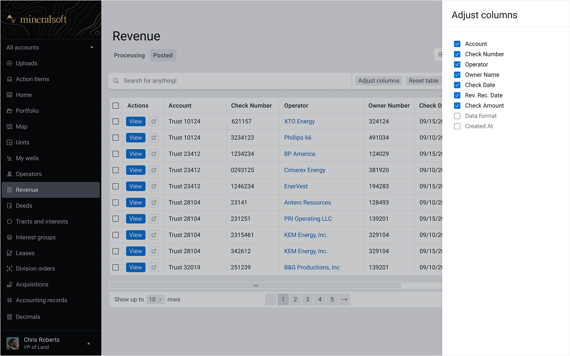
Current implementation of "Adjust Columns"
AG Grid also allows the dragging of columns to change the width and order. I have personally witnessed many of our users meticulously and obsessively attempt to resize the table to their ideal specifications. To abate this struggle, I would have the column widths set by users persist upon page refresh. However, that is a current application limitation and a routine that our users learn rather quickly. Preserving the user’s UI customizations is an improvement that can greatly improve their experience.
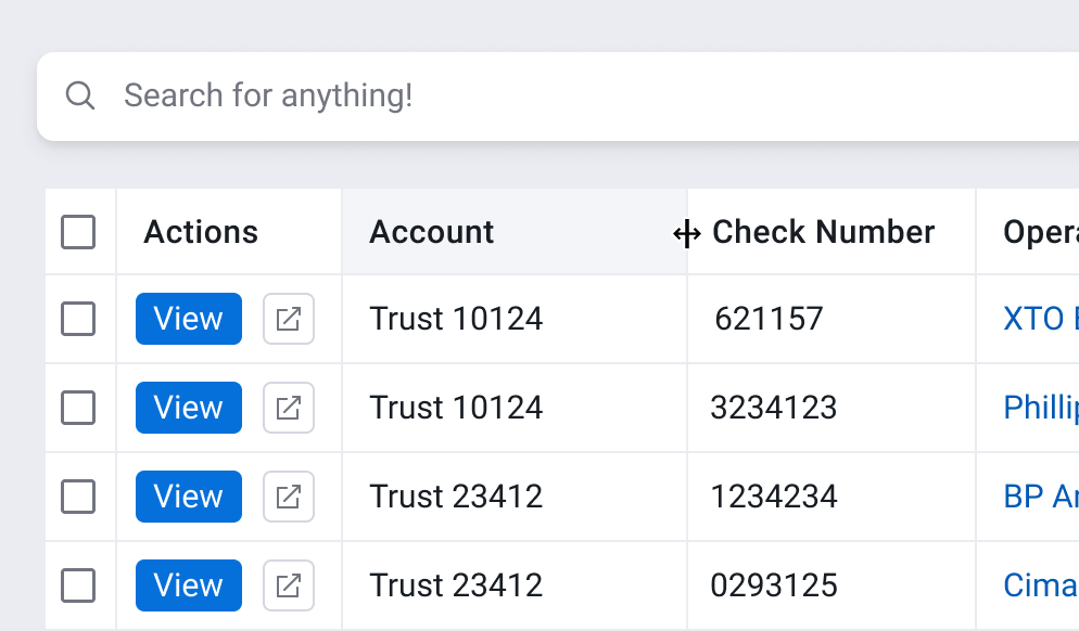
The Drag icon shows up on hover, allowing users to change the width of a column on the left.
Adjusting columns to meet the user's needs is critical for a good user experience in data tables. The features I mentioned are not difficult to figure out after being on our platform for a while, but I dispute the likelihood of early discovery.
"Reset Table" is a little ambiguous if you are reading these words for the first time. Better words to describe this action are "Restore to default." I also believe we can include this button in the "Adjust columns" panel since it is relevant to the customization of columns and not an action sought very often.
Allowing users to set the order of columns would also be an excellent feature to add in the “Adjust columns” panel. I would like to have the universal dragging icon on the left side of each column's name. In addition, having a drop shadow effect on hover of the column name should clue a user into dragging and dropping to reorder. After completing all actions, users can save the changes permanently, but columns reordered on the AG grid should override these settings.
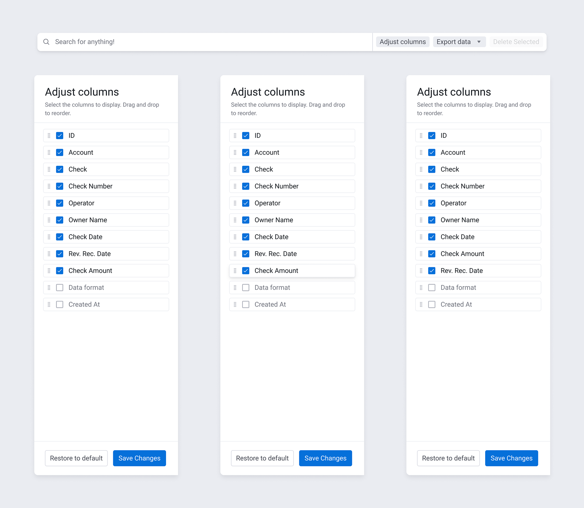
Proposed Re-design of the "Adjust Columns" panel
2. Horizontal Scrolling
With the number of columns we have in our tables, horizontal scrolling is inevitable. While I would love to reduce that number, the current implementation of our tables necessitates that amount. One day, to my horror, I was on a call where a user told me that he did not know one of our tables was horizontally scrollable! He was not a power-user of our product and did not own a wheeled mouse or trackpad to scroll quickly. I mistakenly assumed that virtually all users would have a scroll-wheel or touchpad, so that moment has remained with me as a lesson in user variability.
The solution to helping with the discovery of a table’s horizontal scrolling is pretty straightforward. First, we need to display the horizontal & vertical scroll bars to indicate when something is scrollable. I recommend showing the scroll bars at 50% transparency by default and increase to 90% transparency on hover. In addition to the scroll bars, I recommend pinning the header and footer elements of the page. As users scroll horizontally, they will feel more grounded and less disoriented.
3. Filters & Sort
AG Grid has a powerful feature to filter and sort each column. But I have been on so many calls where customers did not know how to perform these basic functions. The current filtering design requires you to click on the three dots and lines icon to the right side of the column header name. A user must click on the sorting icon between the column header name and the filter icon for sorting. As a result, filters & sorting become a must-to-cover topic in a support or training call. However, I find this a very solvable problem with simple but elegant design improvements.
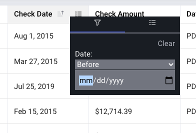
Current implementation of a column filtering
Filters and Sorting are a familiar design pattern in online shopping sites and for other software products. We can easily replicate this pattern to make filtering and sorting more user-friendly. The "Filters" button can open up a side panel with a list of column cards, similar to "Adjust columns". Clicking on a column should expand the card so that a user can set the suitable filtering options for that given column. The "Revert to default" option would again be helpful here.
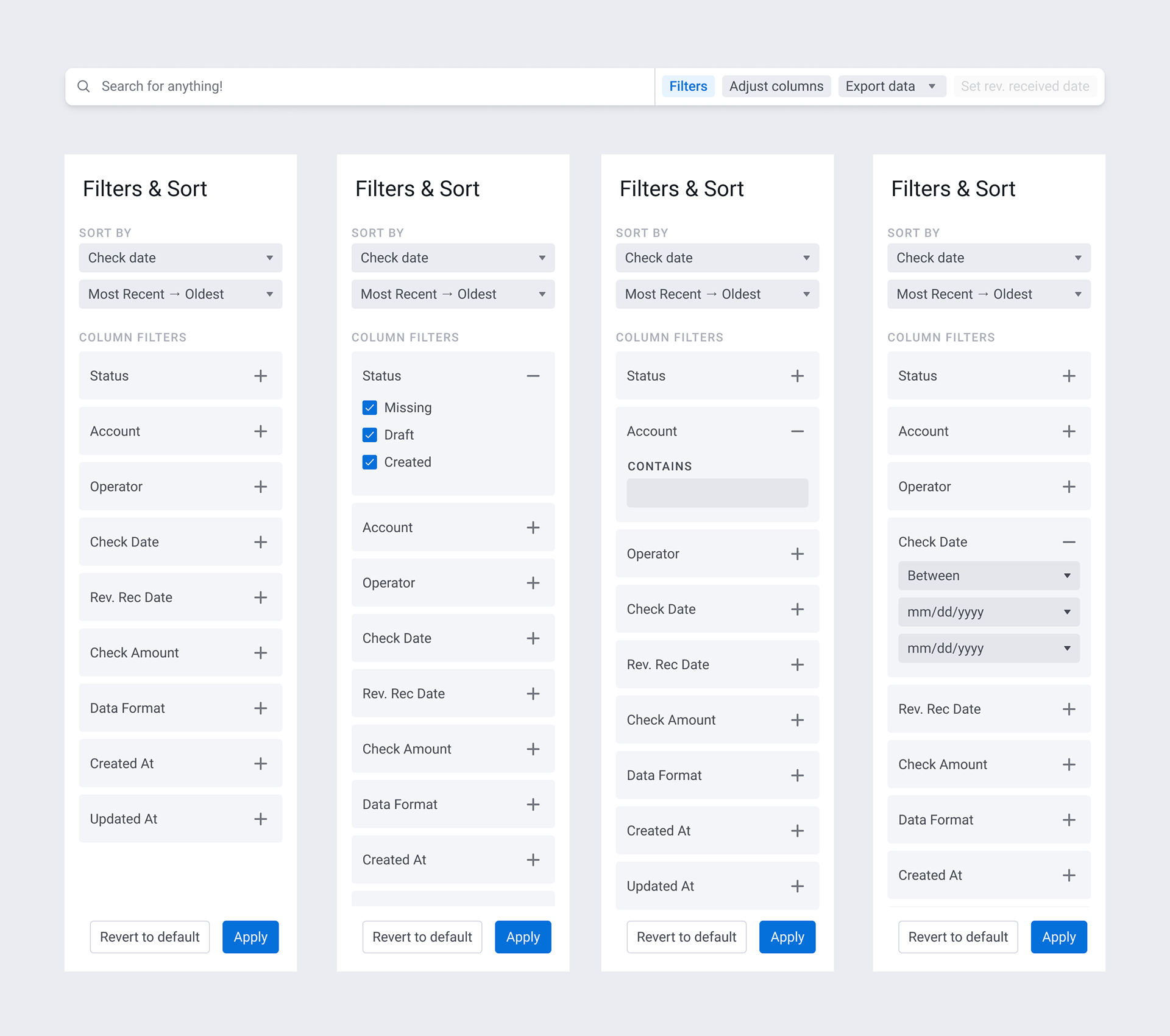
Proposed design of the "Filters & Sort" panel
It is essential to pay attention to component discoverability, because helping users discover supplementary features will increase product usage and satisfaction. The solutions I have outlined only begin to touch the surface, and I am cognizant of the importance of continuing to learn from user feedback and observation. From this I hope one can recognize that common platform issues with the discoverability in tables and other elements are solvable with a thoughtful and considerate design approach.