Project type: Design project at Mineral Management Company
Project length: 4 months
My role: Product Designer
Collaborators: Product manager, developers, (internal) operation team members, customers
Project length: 4 months
My role: Product Designer
Collaborators: Product manager, developers, (internal) operation team members, customers
About Mineral Management Platform
This enterprise software powers a mineral management platform for oil & gas assets, serving banks, investment funds, family offices, E&P companies, government agencies, and universities. It provides portfolio insights, revenue auditing, and cash flow analysis, enabling mineral managers to track investments, optimize portfolios, and make informed acquisition and divestiture decisions.
Sustainable Advantage: Integration
One of the key reasons for choosing the Mineral Management Platform is its integration with DataFlow. DataFlow is a platform within EnergySync that provides customers access to digital revenue statements and JIB invoices that would otherwise arrive by mail or through individual operator portals. Revenue statements and invoices vary in format across oil and gas operators, making them difficult to interpret. However, DataFlow partners with 90% of operators in the U.S., delivering standardized, easy-to-understand statements.
*Company names have been fictionalized to white-label proprietary solutions.
How Revenue Data Flows into the Mineral Management Platform
Revenue statements from DataFlow-connected operators automatically sync with the Mineral Management Platform as soon as they are received and processed.
For revenue statements from out-of-network operators, customers can manually upload them to the platform. If the statement is in paper form, it must be scanned and converted to a PDF before submission. These statements are processed within a three-day service level agreement, ensuring timely access to financial data.
Project History
When I joined the Mineral Management Company, a new revenue processing module had just been released. Two key features—Posting Workflow and Check Reconciliation—were introduced to support bank customers by improving data control and financial tracking.
Posting Workflow
Banks required greater oversight in their revenue processes, so statements were set to be "unposted" by default. This meant revenue statements required manual review and approval before being reflected in revenue-based reports. Once posted, banks could up-feed the revenue data into their systems to facilitate deposits for their customers.
Banks required greater oversight in their revenue processes, so statements were set to be "unposted" by default. This meant revenue statements required manual review and approval before being reflected in revenue-based reports. Once posted, banks could up-feed the revenue data into their systems to facilitate deposits for their customers.
Check Reconciliation
Mineral managers often receive paper checks from operators and previously tracked them manually in Excel. To streamline this process, we introduced a feature that allowed managers to create check records within the system. This enabled them to verify whether corresponding revenue statements existed, ensuring accurate reconciliation and reducing manual errors.
Mineral managers often receive paper checks from operators and previously tracked them manually in Excel. To streamline this process, we introduced a feature that allowed managers to create check records within the system. This enabled them to verify whether corresponding revenue statements existed, ensuring accurate reconciliation and reducing manual errors.
Design Challenge
When I joined, the user experience of these new workflows was confusing for newly onboarded customers. Many struggled to navigate the system and complete their tasks efficiently. I set out to redesign the revenue processing workflow to make it more intuitive and user-friendly, while also reducing the need for support and training calls.
Here are the original designs before I made any changes:
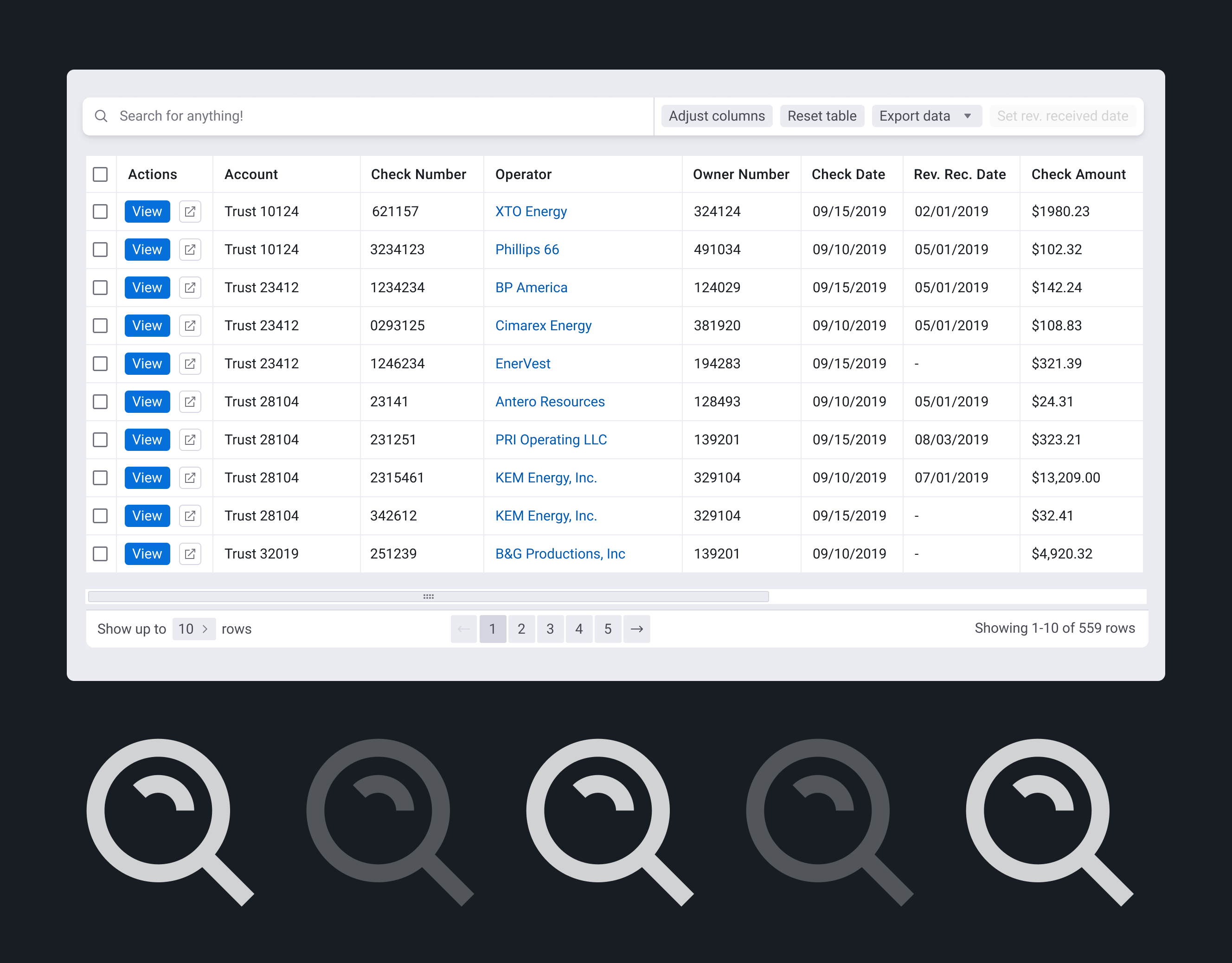
The "Incoming Revenue" page allowed all unposted checks and check details to live,
except for the "Recently Posted" tab. (Before design)
All posted statements showed up on the "Revenue" page. (Before Design)
I spoke with the product manager and developers to understand the reasoning behind the current implementation. I learned that the split into two pages was primarily due to technical constraints. The existing account switcher in the side navigation allowed users to change accounts, but the new module aimed to streamline bank customers' workflows by enabling them to drop checks for all accounts from a single view.
This led to the creation of the "Incoming Revenue" page, where users could see all accounts in one table, regardless of which account they were currently viewing. Meanwhile, the "Revenue" table remained account-specific, displaying only the statements for the selected account (e.g., "Benchmark Fund IV").
Internal Research
To better understand the revenue processing workflow, I met separately with four operations team members who train and support customers daily. Their insights were invaluable in evaluating the usability of recent releases.
Using my test account, I asked them to complete key tasks and answer questions, including:
1. Create a check
2. Find a check, matched with check details
3. Post a check
4. Add a check to the check details missing a check
5. Identify scans with errors
6. Delete a check
7. Explain the purpose of each tab
8. Explain the difference between "Incoming Revenue" and "Revenue" pages
After compiling my color-coded notes, I presented the findings to the product and engineering teams. One major takeaway was the excessive number of tabs and pages, which made navigation confusing and time-consuming, especially due to slow data loading.
Working documentation that I shared with my team
Design Iteration
I then focused on improving the Revenue module, incorporating feedback from the product and engineering teams, operations team members, and two customers actively using the module in production. Their insights helped identify key pain points and opportunities to streamline the workflow for a more intuitive and efficient user experience.
First Design Iteration
For my first iteration, I removed the "Incoming Revenue" page and introduced two status columns: Checks and Check Details. These columns clearly indicated the status of each object—users could post checks in the "Created" status and check details in the "Received" status. While customers and operations team members responded positively to this design, the engineering team flagged feasibility concerns. Mixing multiple existing tables created significant implementation challenges.
After multiple iterations and discussions with engineers, we reached a final design compromise.
The workflow was structured into three primary tabs: Processing, Unposted, and Posted. Under Unposted, both checks and check details were listed, with status indicators making the next actions clearer.
One tradeoff was that adding a status column increased table width, requiring more horizontal scrolling. While not ideal, the added clarity in navigation and workflow visibility made this a worthwhile compromise.
Final Design: Revenue / Unposted / Check Details
Final Design: Revenue / Unposted / Checks
Final Design: Revenue / Posted
Final Thoughts
Since the new release, we’ve received positive feedback from customers who find the platform easier to navigate. Eliminating the need to switch between pages has been a huge time saver, and the clear status indicators for checks and check details help users stay informed.
"I like everything being on this page where we don't have to toggle back and forth so much. It's much cleaner looking!" – Quote from a customer
However, one unresolved issue is the Account column on the Revenue page, which creates an anti-design pattern. Ideally, the account name in the side menu should match the data displayed in the table. A potential solution is to introduce an "All Accounts" option in the account switcher, allowing users to view cross-account data while still having the option to filter by a specific account.
Another concern raised by the engineering team is the potential performance impact of the cross-account Revenue table as data accumulates over time. To address this, our next iteration will introduce time filters, defaulting to displaying revenue data from the last 12 months to optimize performance.
Some of these ideas still need to be validated with users, and usability will continue to be monitored as more bank customers are onboarded.


